
Are $500k+ Earners Living Paycheck to Paycheck?
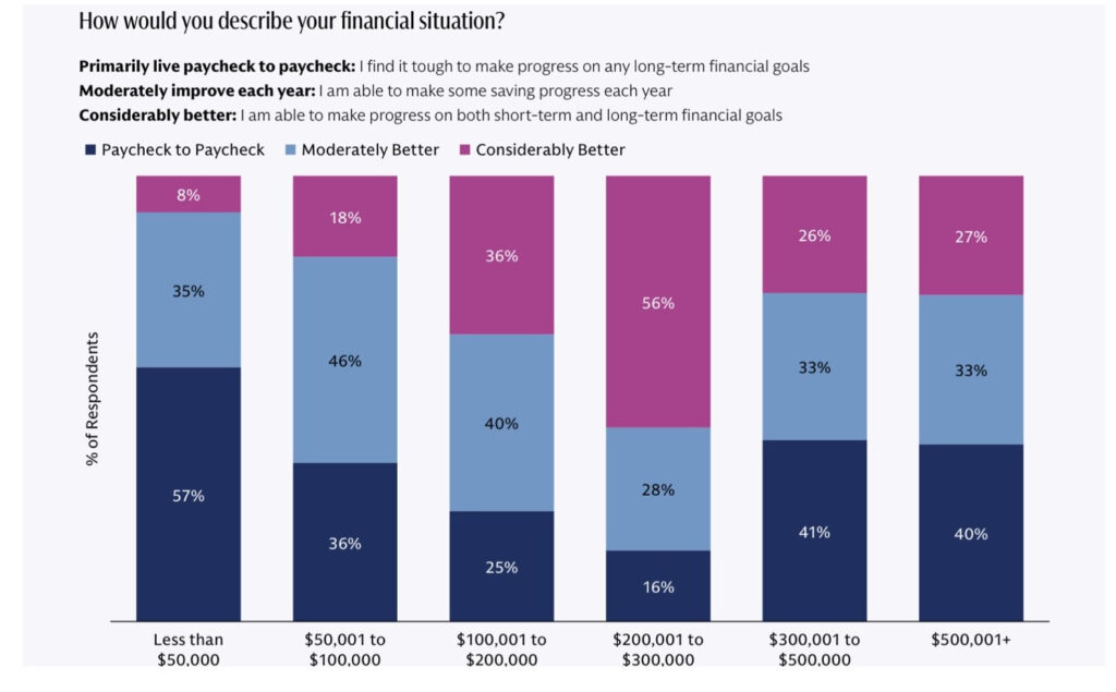
This chart, from the 2025 Goldman Sachs Retirement Survey & Insights report, linked HERE has been making the rounds on social media and it provides a fascinating look in to the dynamics of income and spending across different cohorts of income levels. But I think it is ripe for further analysis.
First, let’s define who exactly they talked to. The survey covered 5,102 respondents, of which there were 1,514 retired individuals and 3,588 working individuals. This particular chart was taken from the ‘working’ section and so comprises only those 3,588 that are working. The age cohorts are broadly diversified, so we are getting a good cross-section of workers across age groups.
